Coop Ale Works – Packaging Rebrand
As an in-house designer at Coop Ale Works, a craft brewery in Oklahoma City, I worked across a wide range of creative projects. My most significant project was working on a full packaging rebrand of the brewery’s core beer lineup.
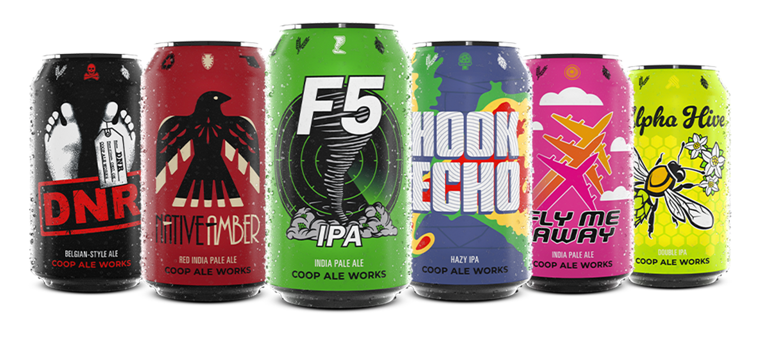
The rebrand included redesigned cans, secondary packaging (boxes and carriers), and a full suite of launch materials such as POS displays, print ads, and digital assets. The goal was to modernize the brand, strengthen shelf presence, and create a cohesive system across products.
I collaborated with marketing, production, and leadership to develop a visual identity that reflects Coop’s evolving personality while staying true to its local roots. Each beer received a distinct look, unified by a consistent design system to enhance brand recognition and differentiation.
This showcase highlights the final packaging, product photography, and promotional materials that supported a successful brand relaunch.
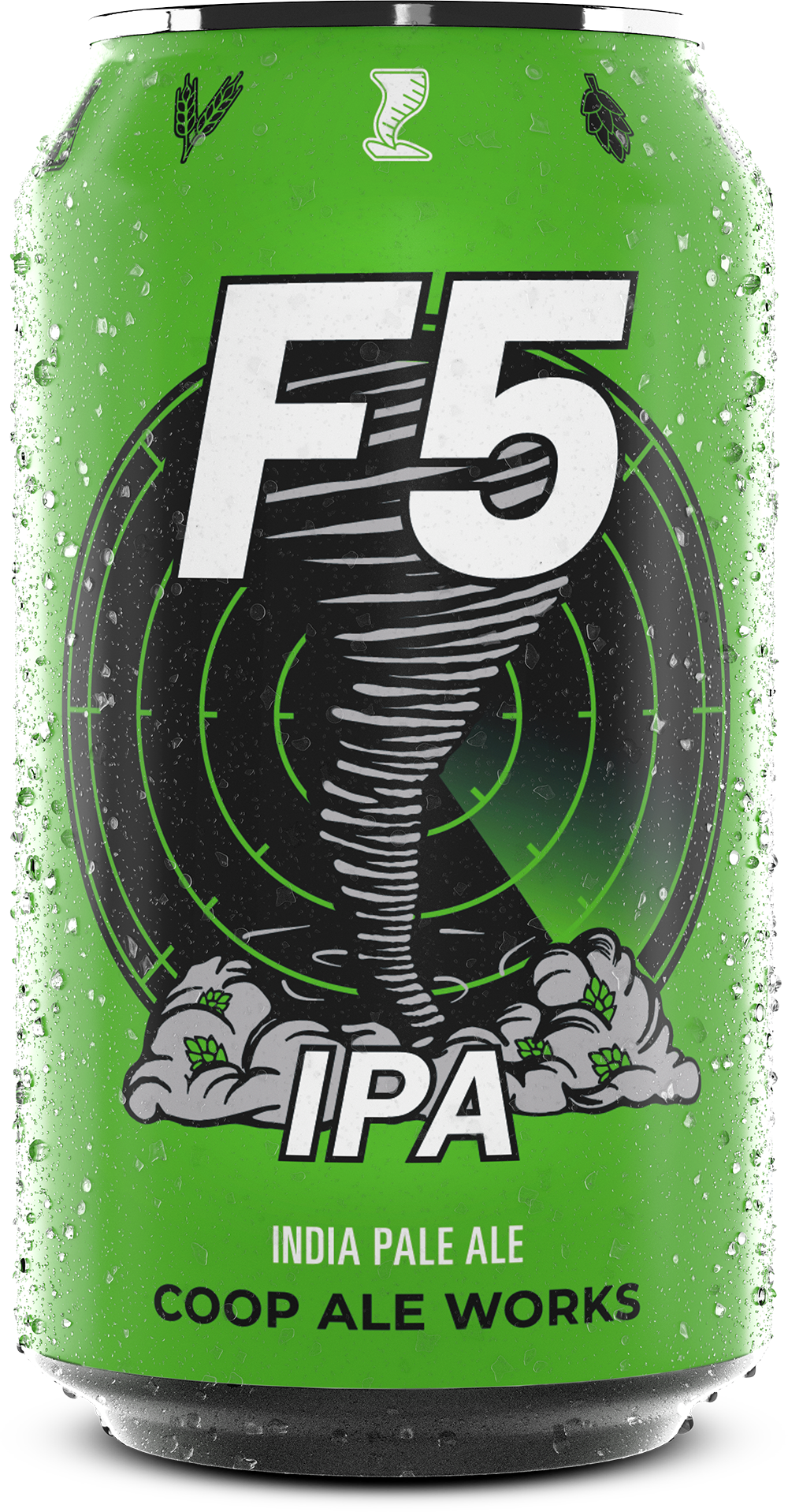
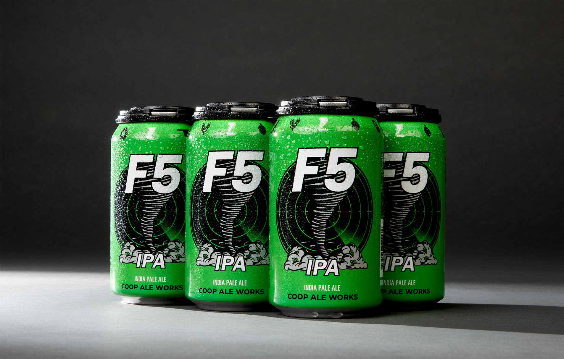
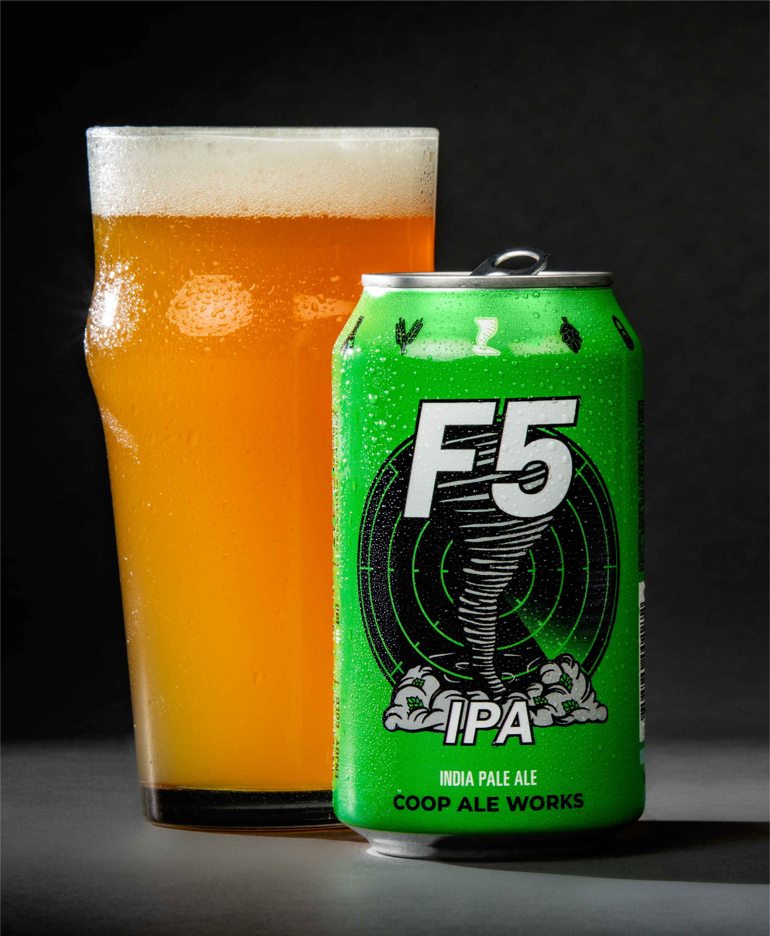
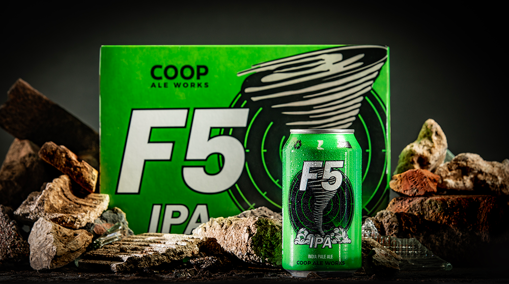
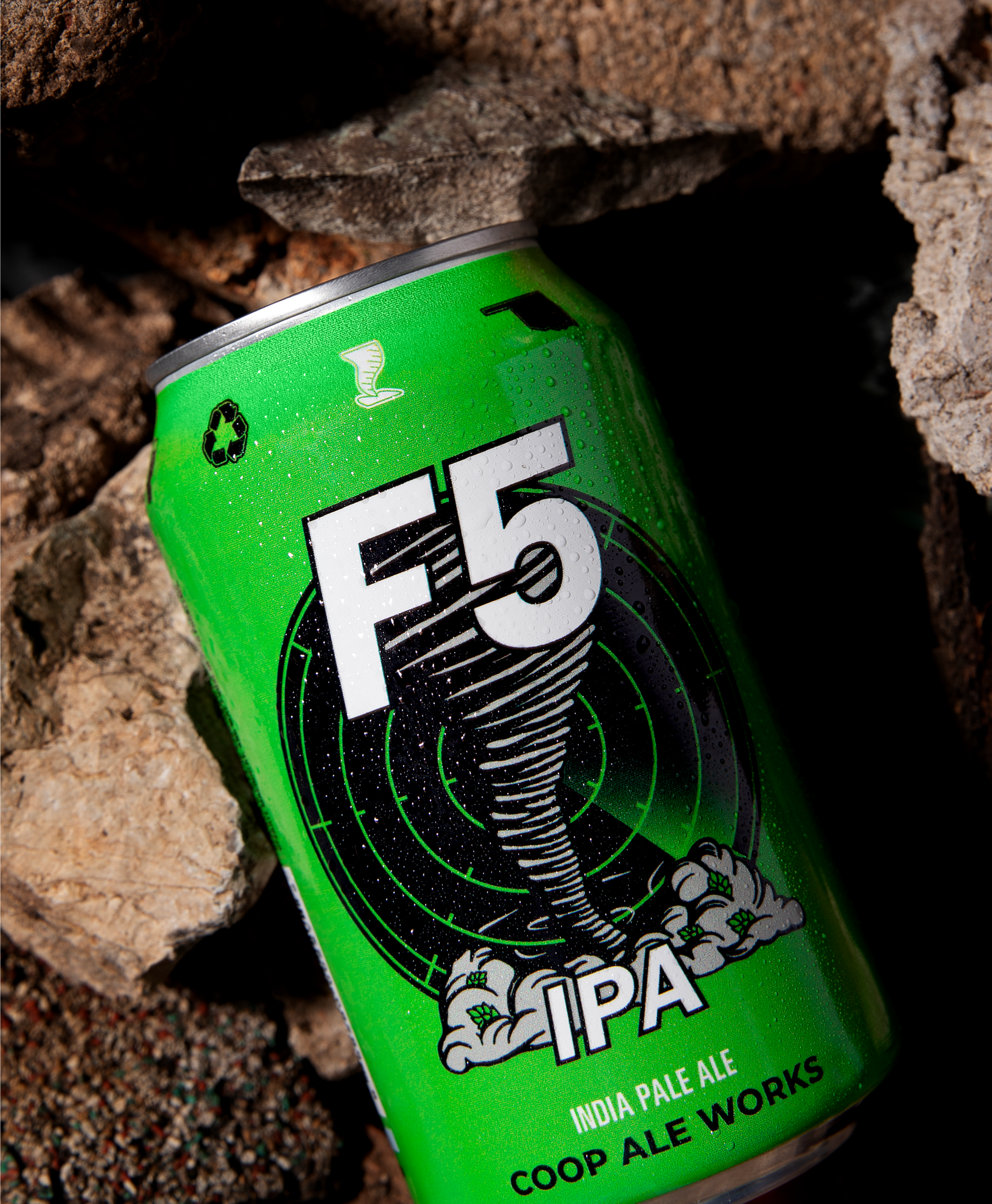
F5 IPA
As Coop’s flagship beer, F5 needed a cleaner, more modern look that preserved its strong brand recognition. The previous artwork was overly complex and difficult to reproduce, so the refresh centered on simplifying key elements, clarifying the hierarchy, and tightening the visual system. The result is a bold, streamlined design that’s easier to produce, more consistent across formats, and instantly recognizable on shelf.

Hop-forward
Classic
Citrusy
Photography: Simon Hurst
Packaging Design: Nick Sexton
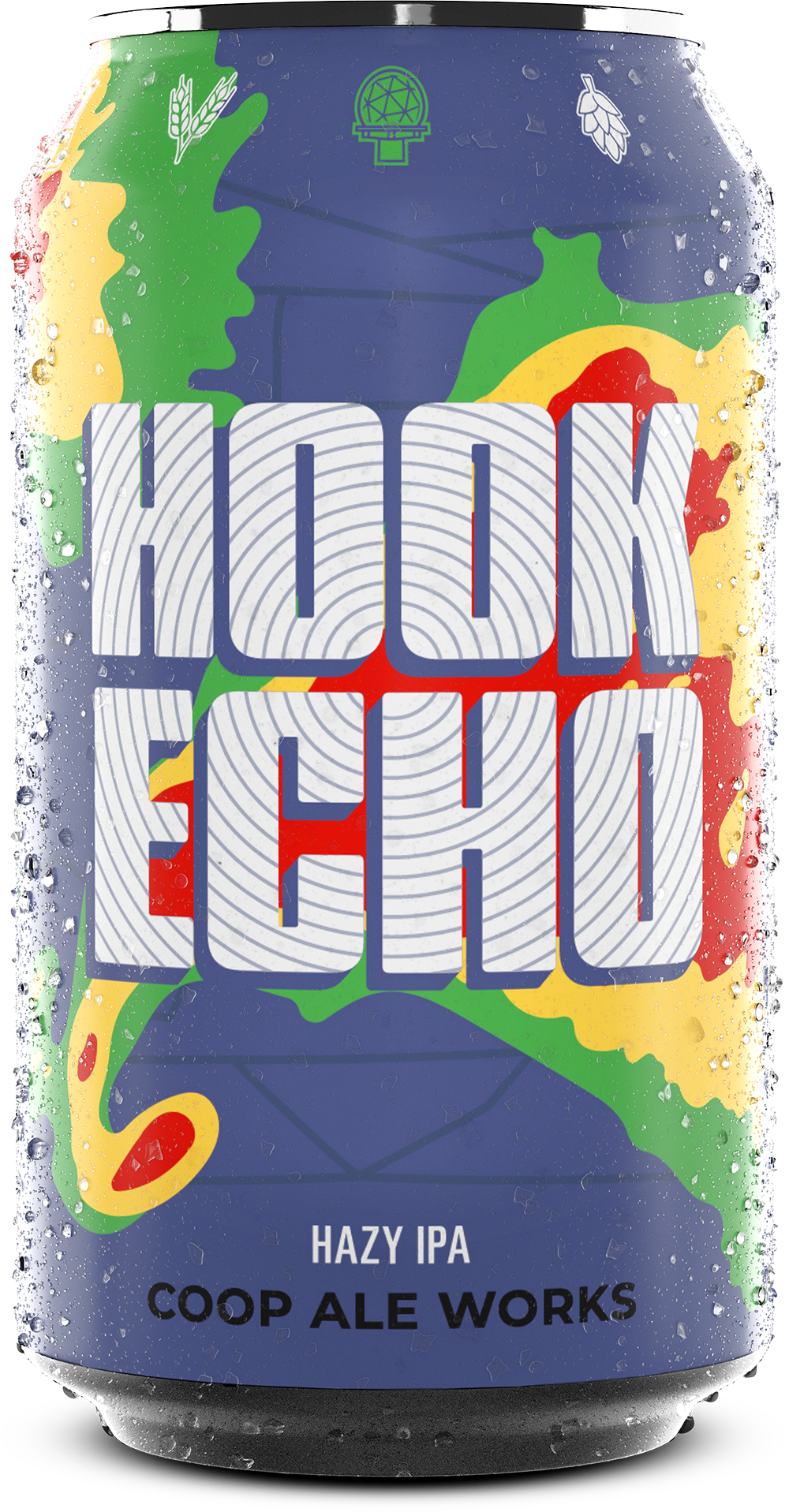
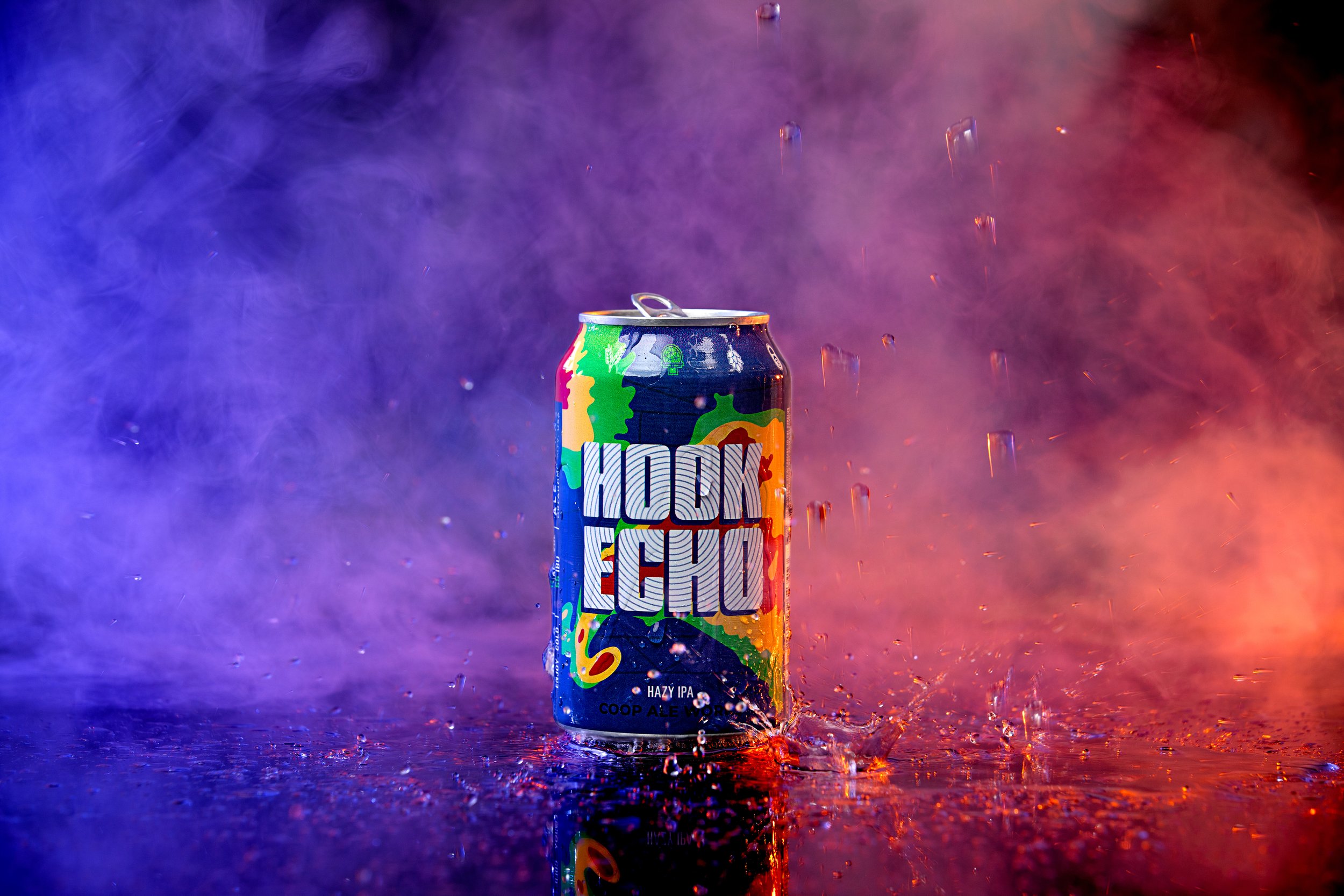
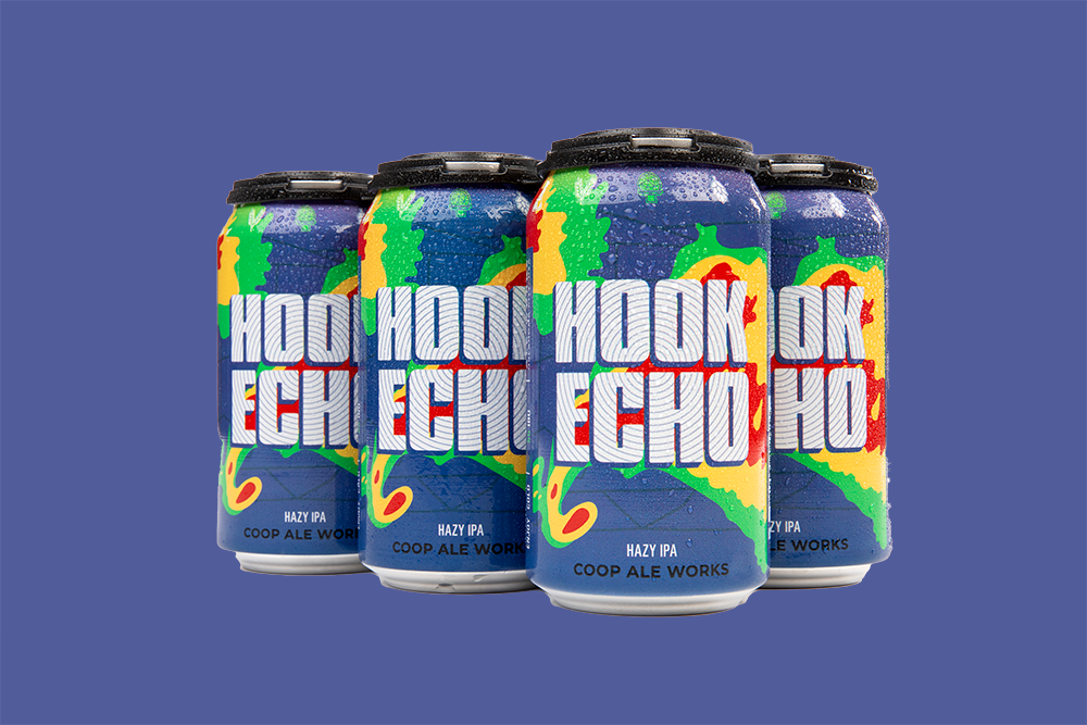
Hook Echo
Hook Echo’s refresh brings a cleaner, more contemporary feel while breaking away from the old badge-bound layout. By using the full can as a dynamic canvas, the design leans into Oklahoma’s storm-chasing culture with bold radar colors and assertive type. The result is a simplified, high-impact system that feels expansive, energetic, and firmly rooted in the Coop brand.

TROPICAL
HAZY
SMOOTH
Photography: Simon Hurst
Packaging Design: Nick Sexton
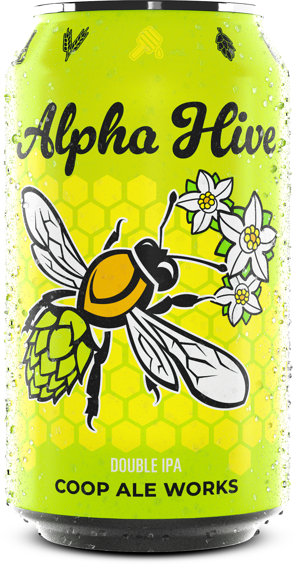
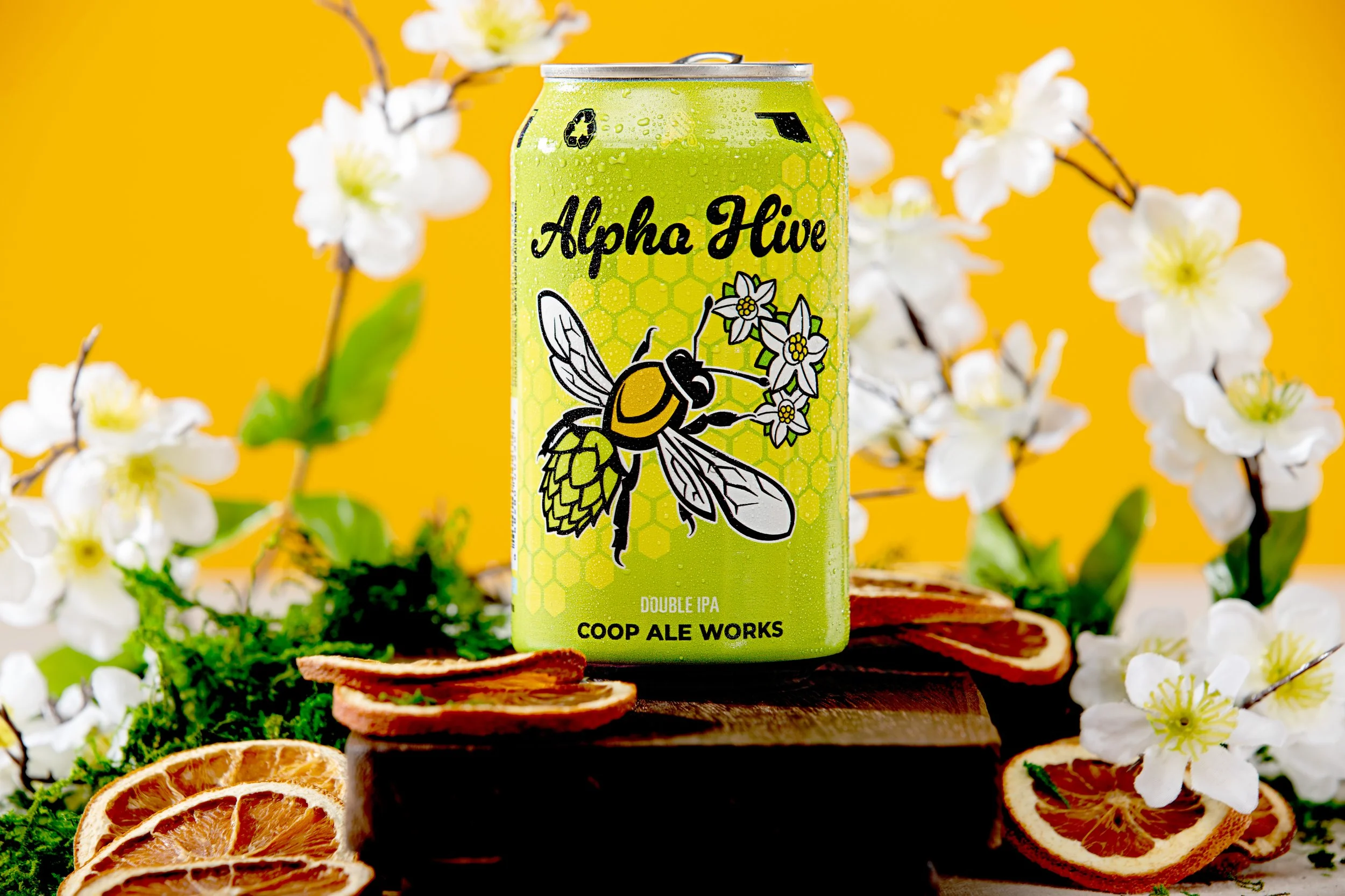
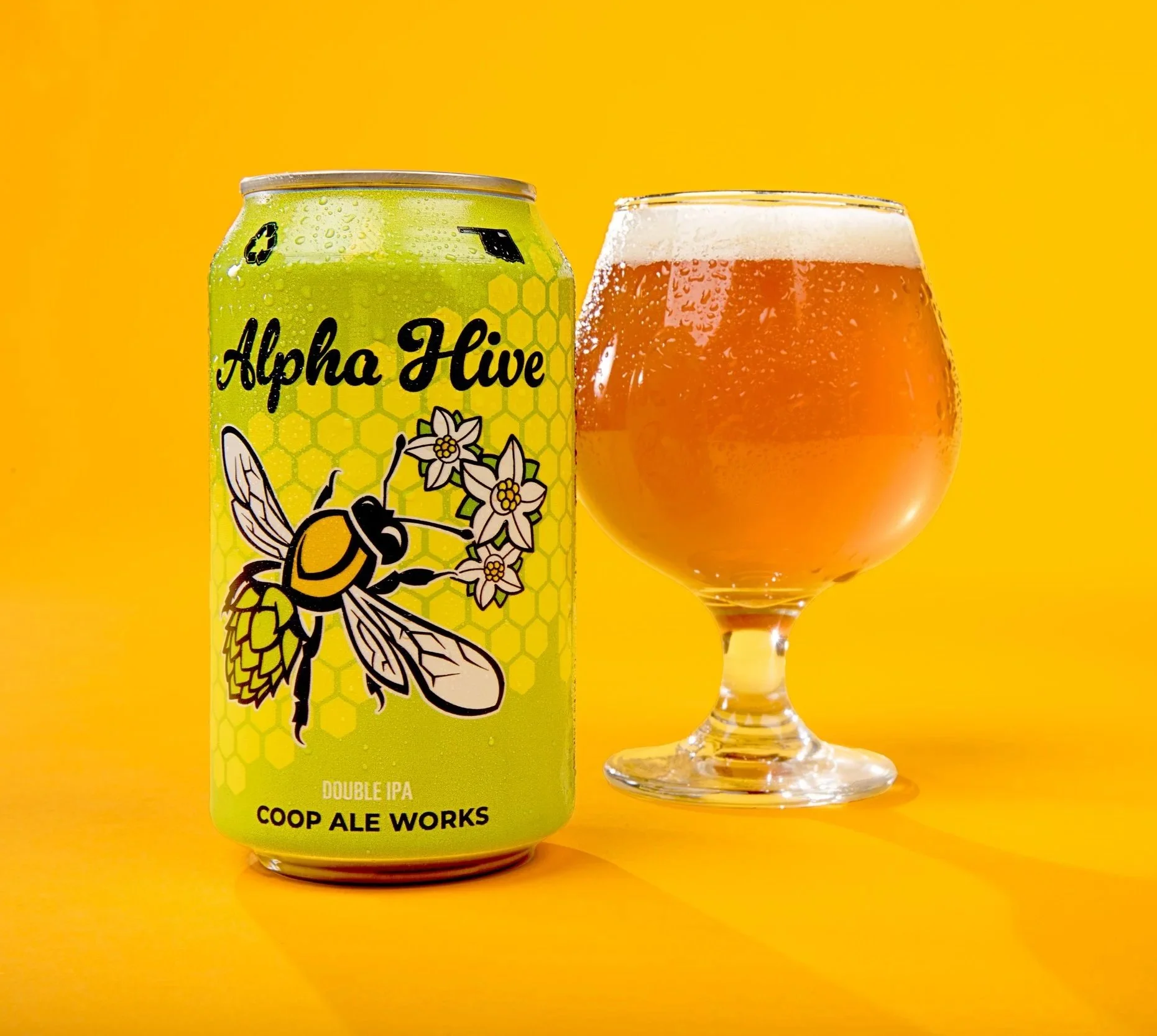
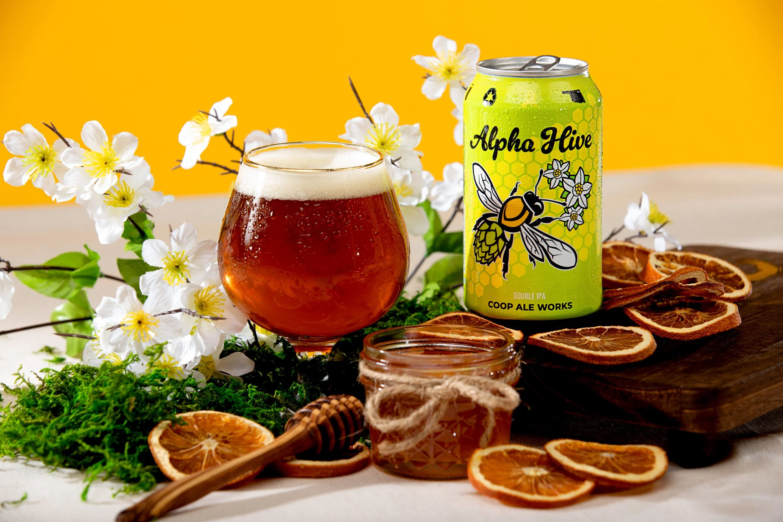
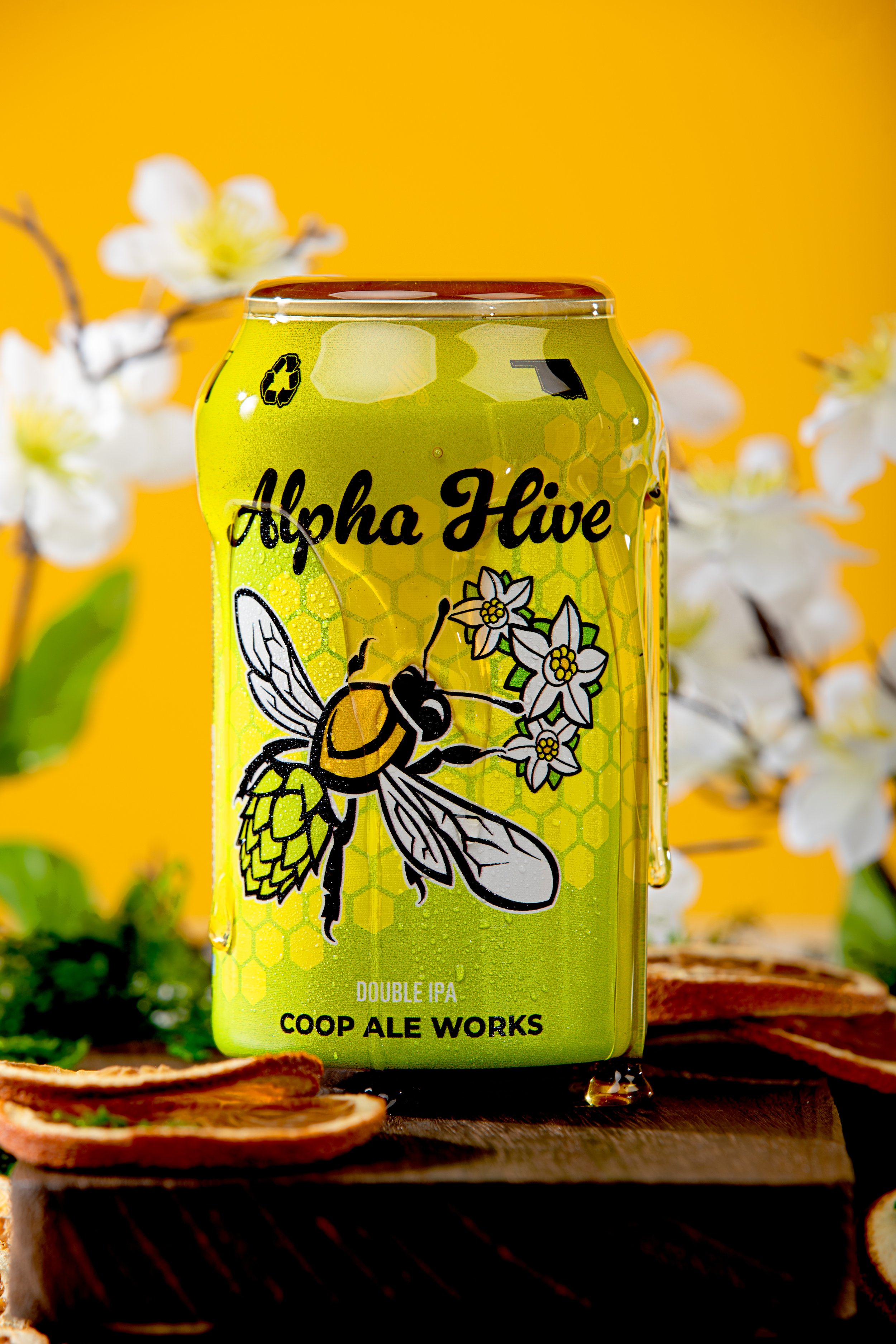
Alpha Hive
This refresh centers on scale, energy, and shelf impact, using bold color and expanded illustration to create a more immediate and recognizable presence. The core graphic was intentionally blown up and allowed to breathe across the full surface of the can, making the design feel more dynamic and confident at a distance. Every adjustment was handled with care to push the visual language forward while maintaining the strong brand recognition the beer already held in the market.

FLORAL
STRONG
HOPPY
Photography: Simon Hurst
Packaging Design: Nick Sexton
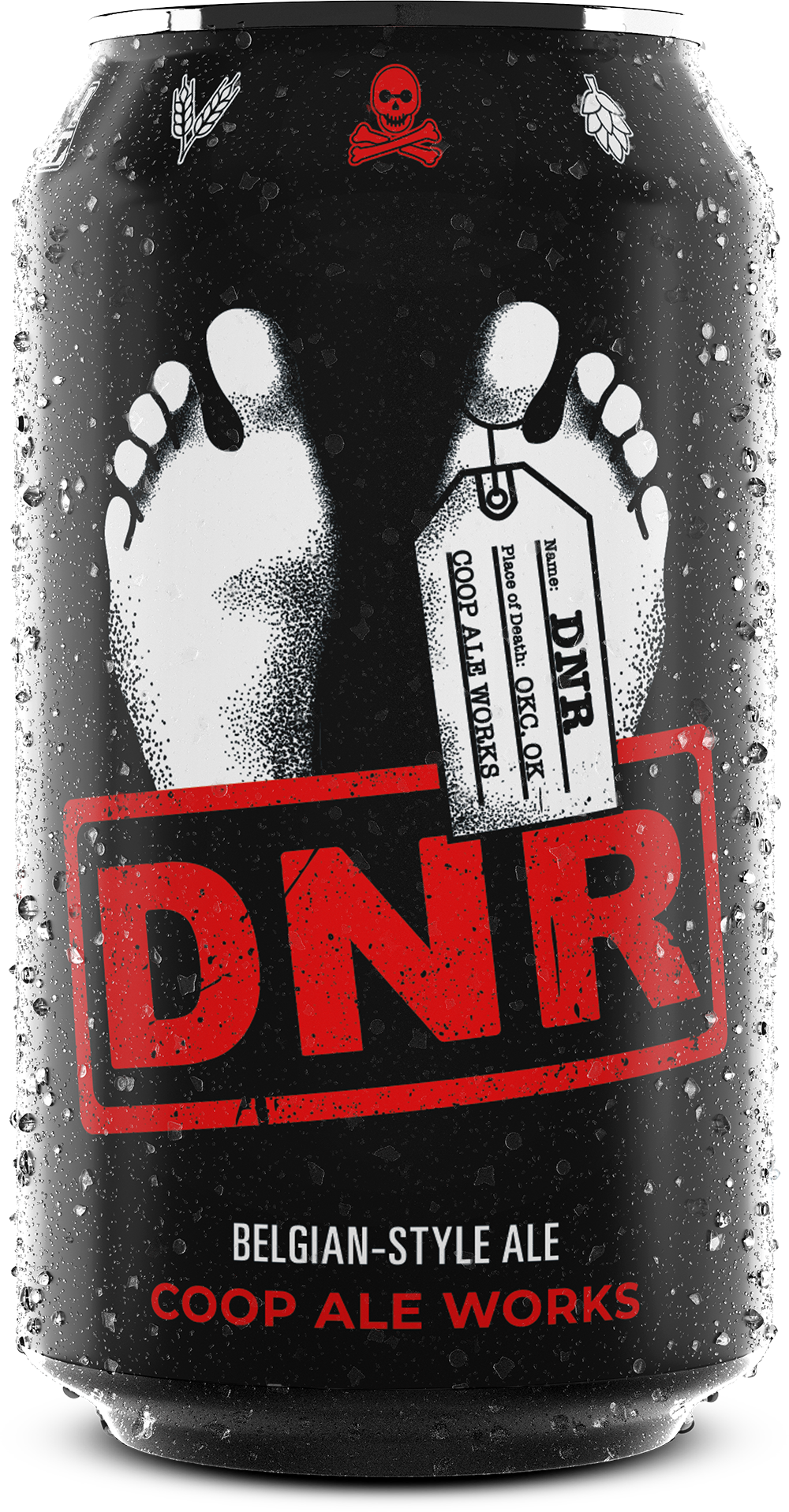
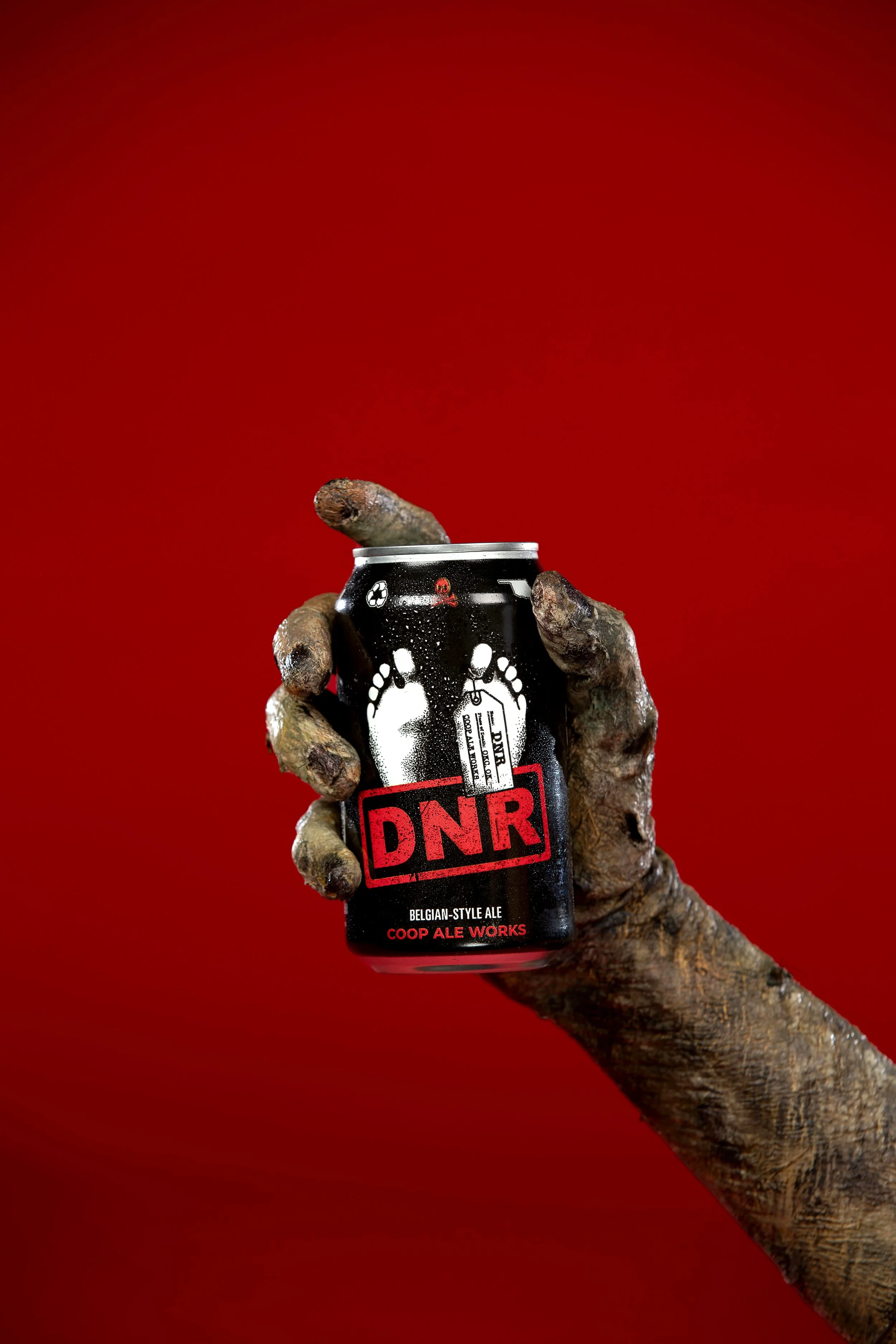
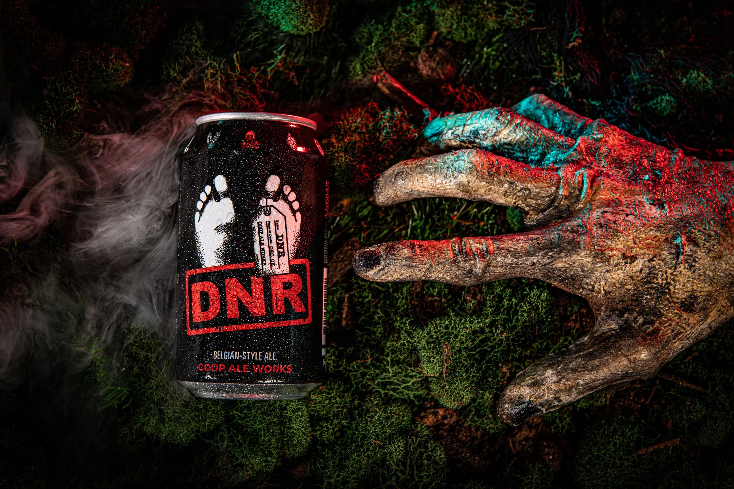
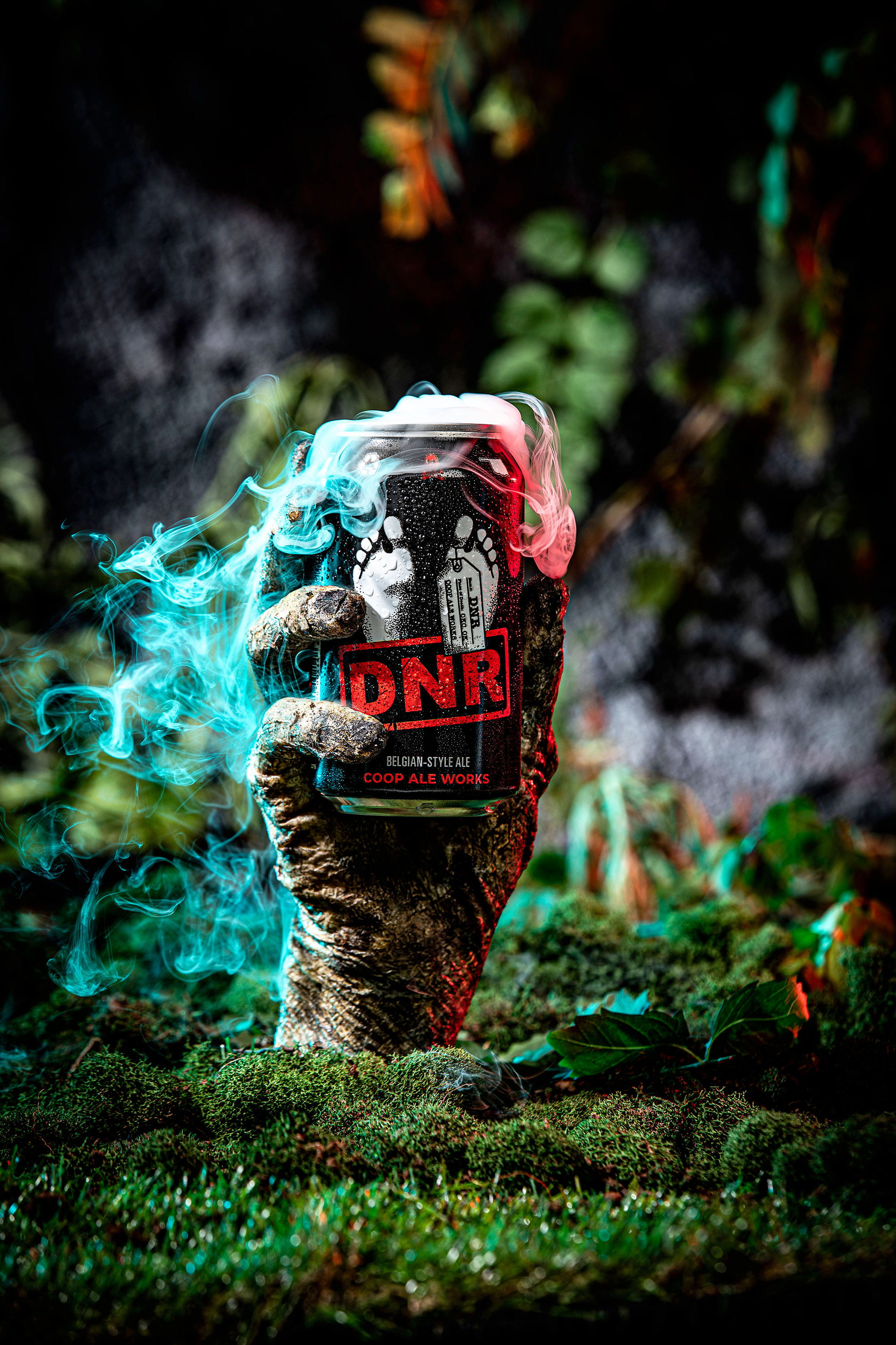
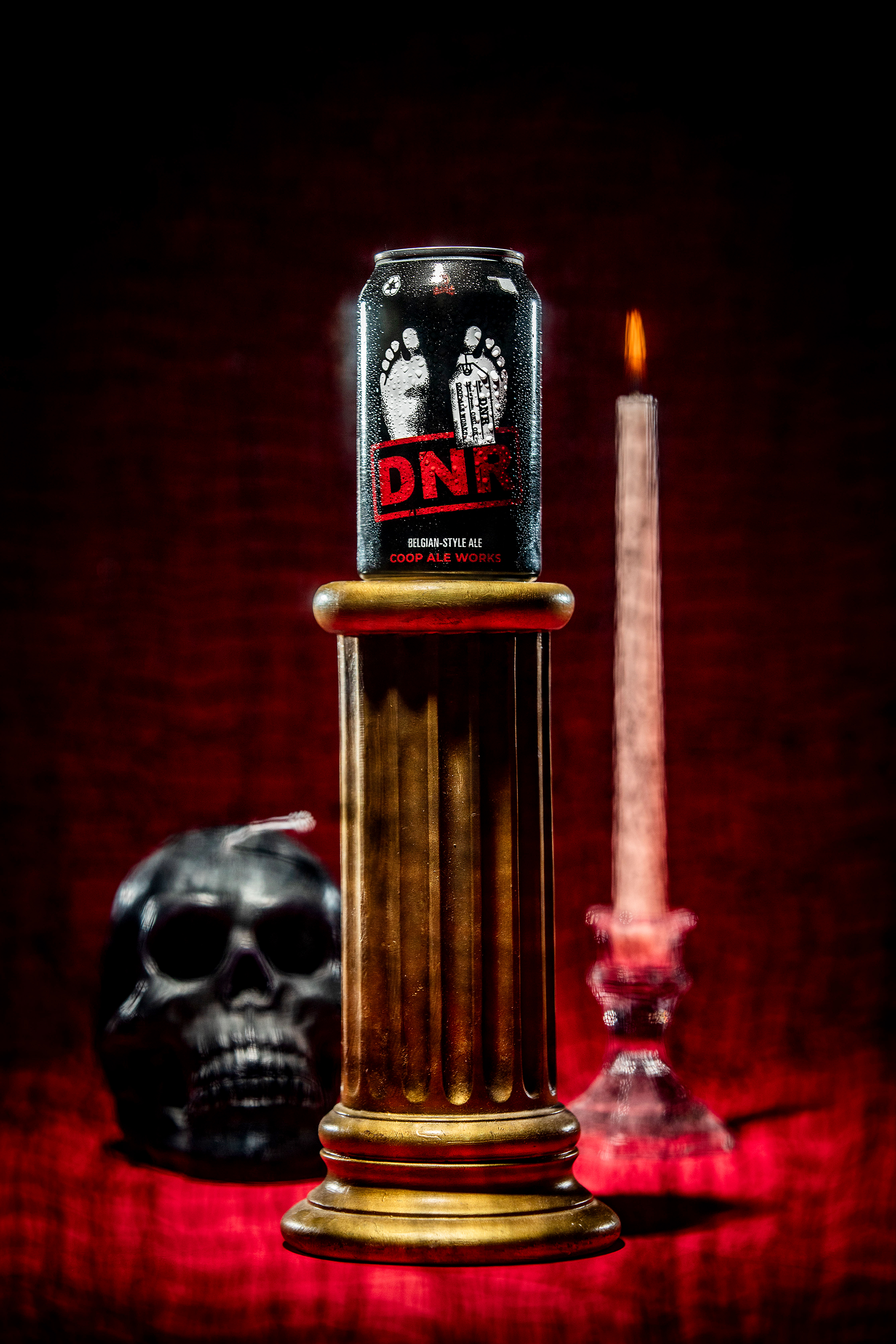
DNR
The DNR can refresh reimagines the original photorealistic, halftone design into a bold, graphic system that aligns with the broader packaging lineup. The update expands the badge into a full-color, scalable mark while maintaining the beer’s dark, malty, and full-bodied character. By shifting to a more illustrative approach, the design establishes clearer visual hierarchy and a more dynamic composition, repurposing the toe tag as a functional element to display Coop branding and beer information—preserving the concept’s edge while improving consistency and shelf impact.
DARK
MALTY
SMOOTH
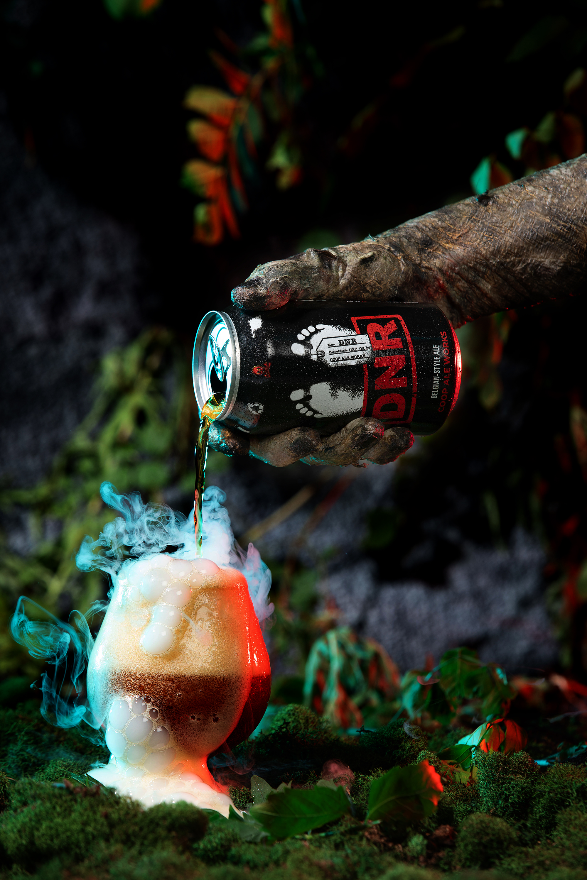
Photography: Simon Hurst
Packaging Design: Nick Sexton
LIMITED RELEASES
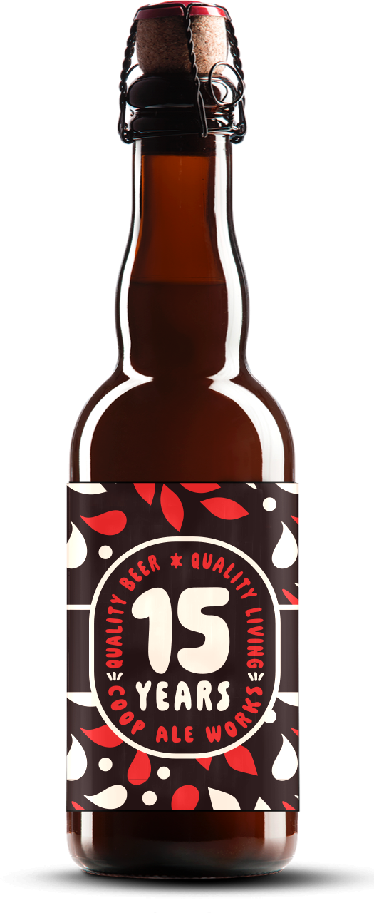
15th Anniversary Stout
A Strong malty stout that pays homage to COOP’s history and origins in brewing.
