Ford Website Menu Study
The goal of this project was to study a website menu that has a substantial amount of content or inventory, and see how we can improve it. I came to the website with a specific task in mind, and recorded my struggles in carrying that task out on the current website, as well as things I liked about it and wanted to keep.
Initial Research
Lorem ipsum dolor sit amet, consectetur adipiscing elit, sed do eiusmod tempor incididunt ut labore et dolore magna aliqua. Ut enim ad minim veniam, quis nostrud exercitation ullamco laboris nisi ut aliquip ex ea commodo consequat. Duis aute irure dolor in reprehenderit in voluptate velit esse cillum dolore eu fugiat nulla pariatur.
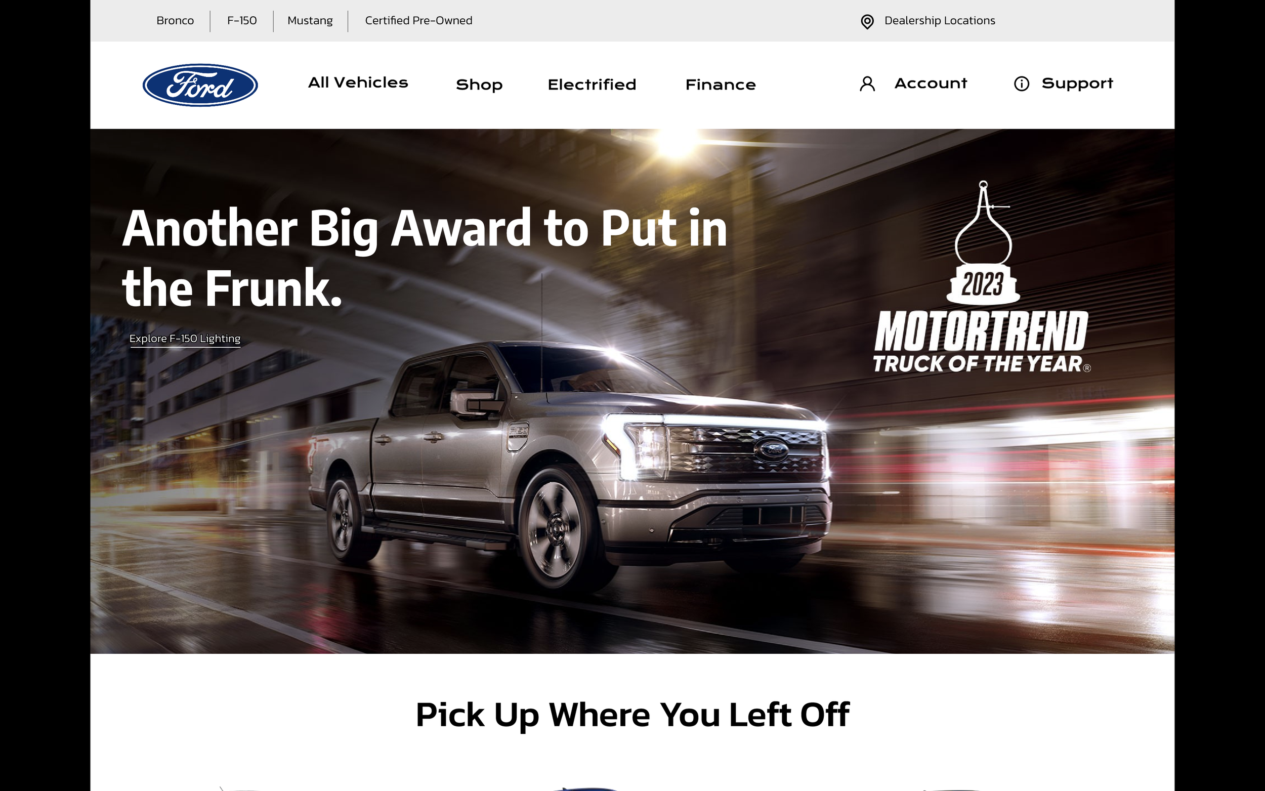
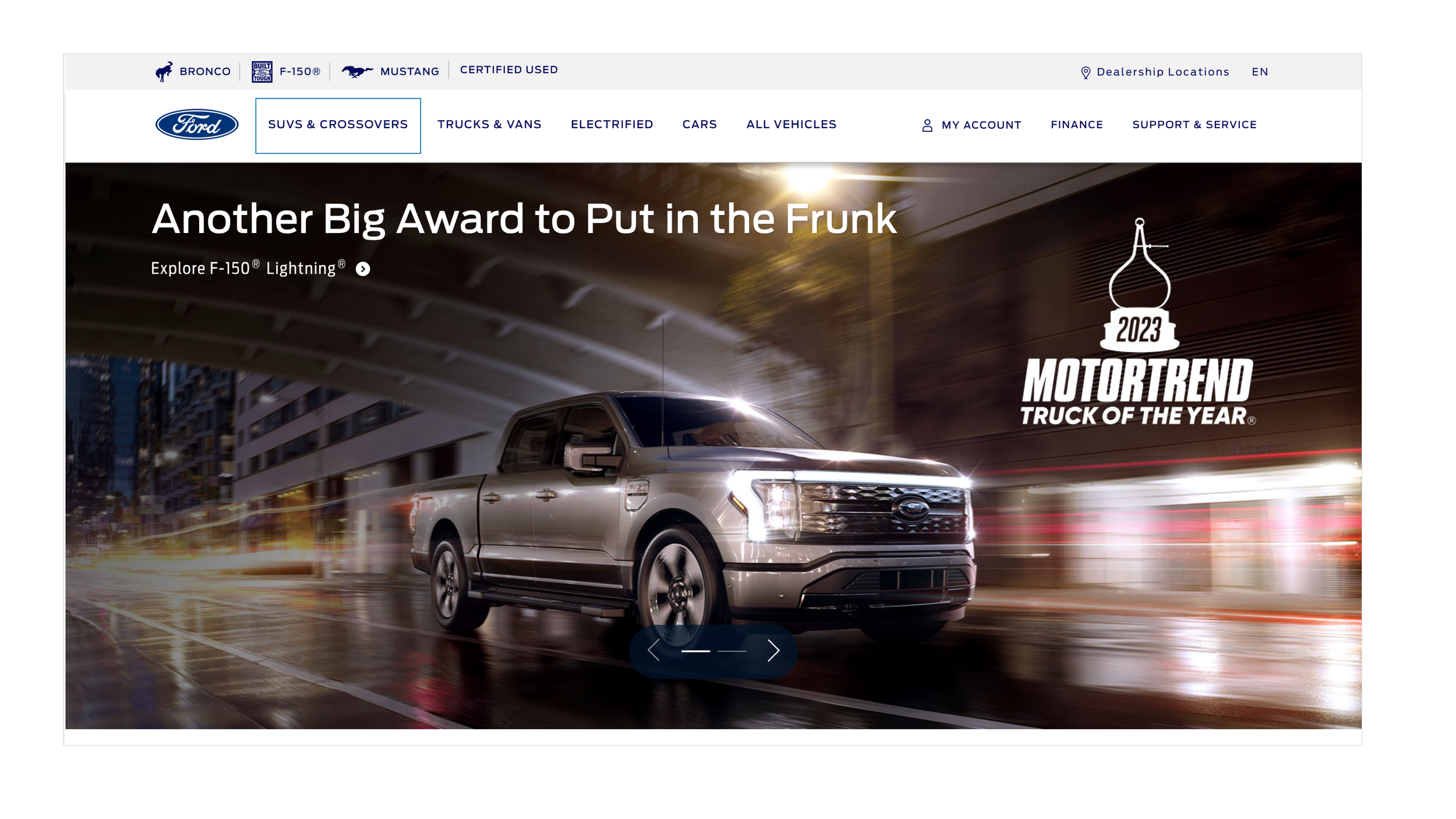
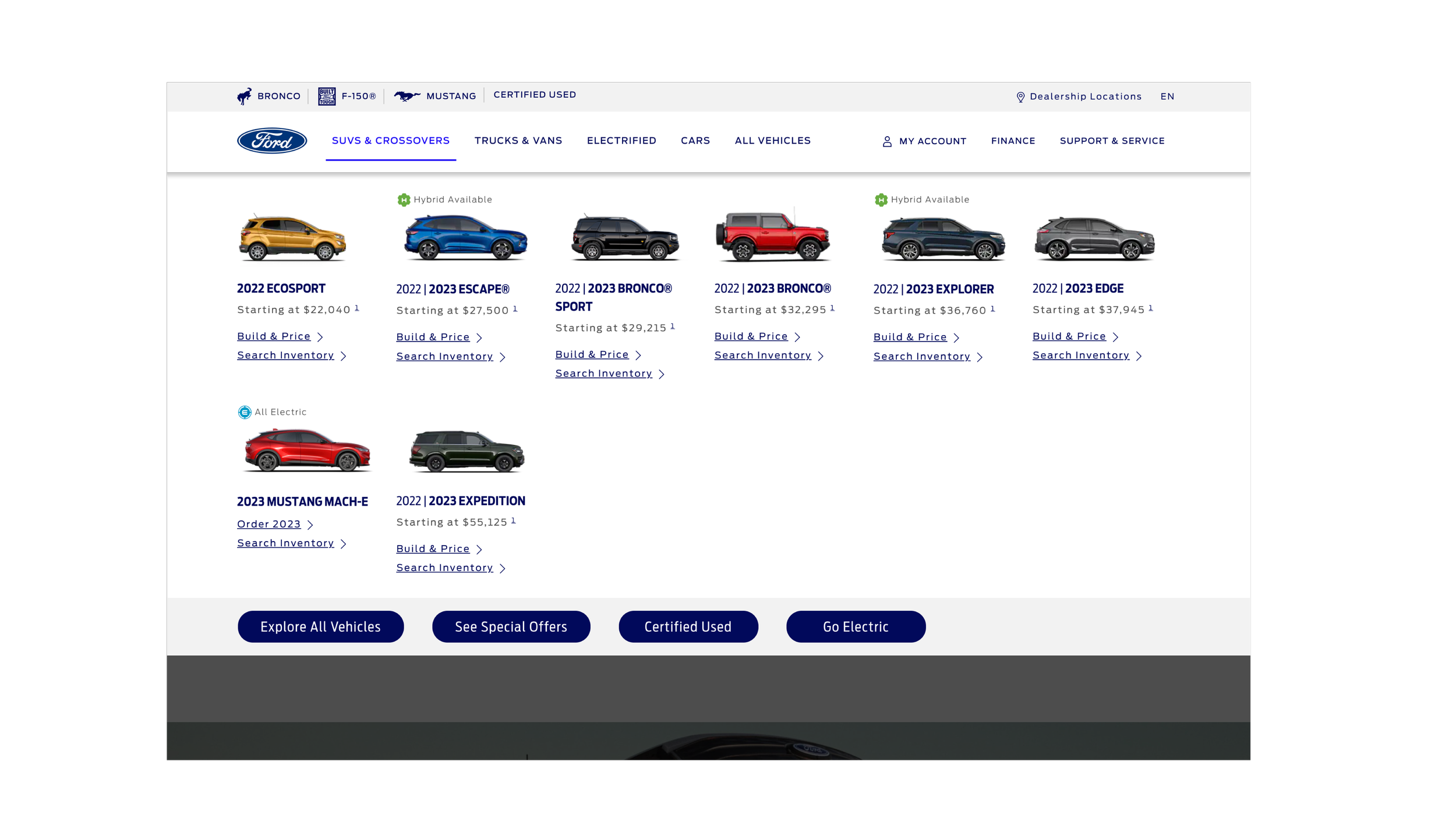
I came to the Ford website in search of browsing for a pre-owned truck with various specifications of accessories, that I can test drive and pick up at a dealer nearby. The first pain point I found in the menu is that they heavily emphasize browsing their vehicle selection of everything they produce, and less on helping you actually purchase and find a vehicle. I was confused on if all the options were to research the vehicles or if any of these would direct me to whats available nearby.
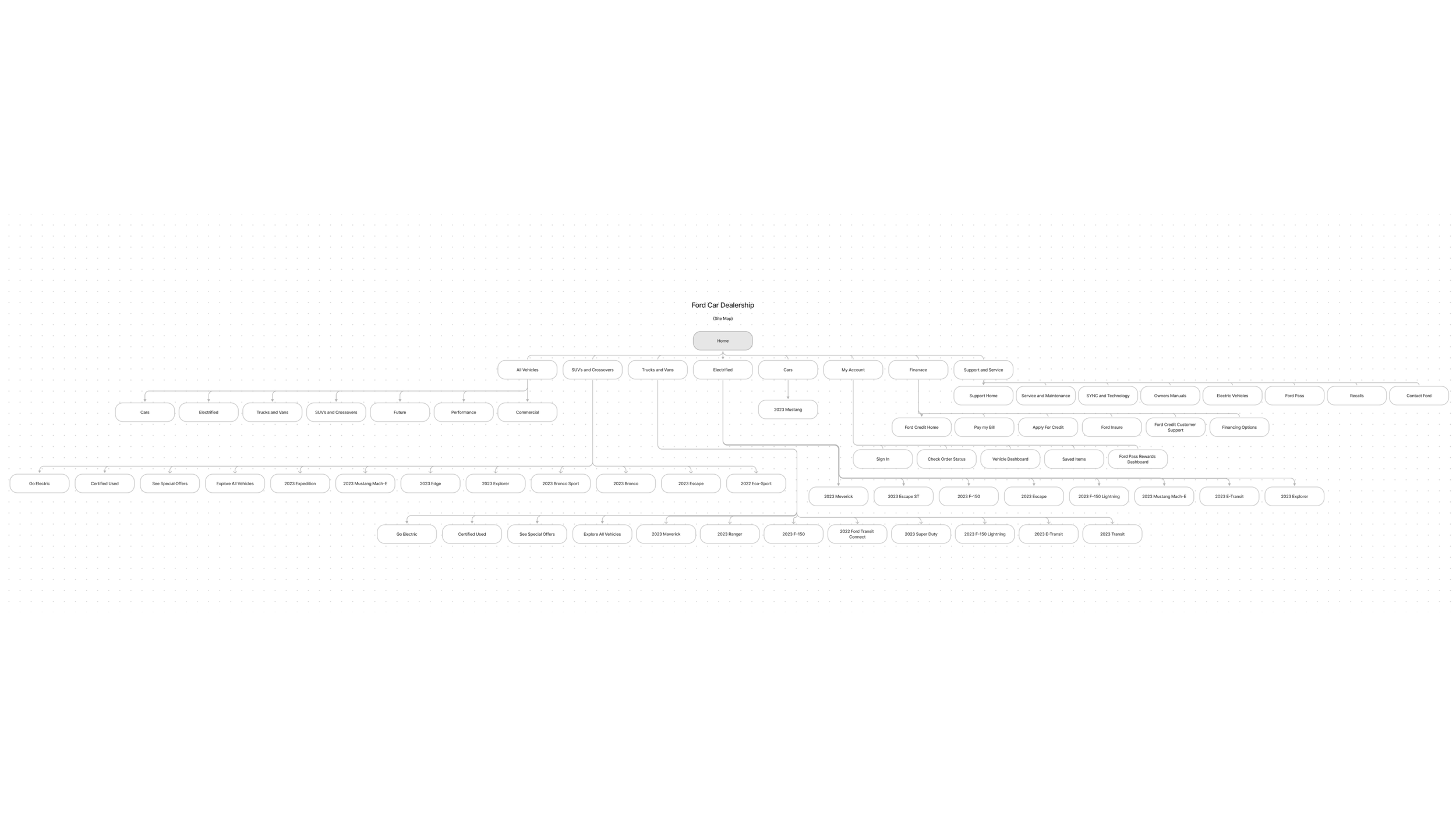
Original Site Map
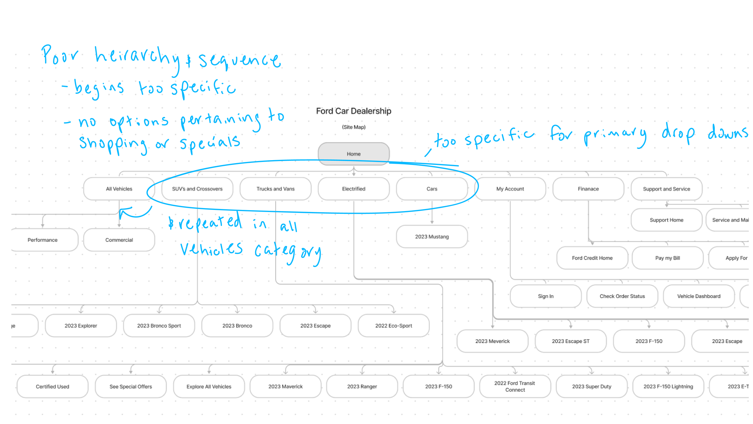
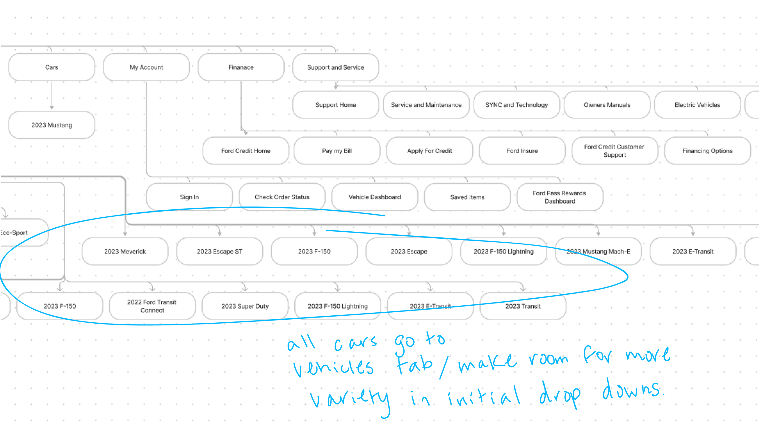
The navigation menu starts out very specific, my main goal ins to restructure the heirarchy to group all the vehicle categories into one drop down and present them further in the sequence, allowing there to be more options to go down from the initial menu tabs. Currently, all the initial tabs take you to browsing a specific vehicle or allude to researching and exploring their selection.
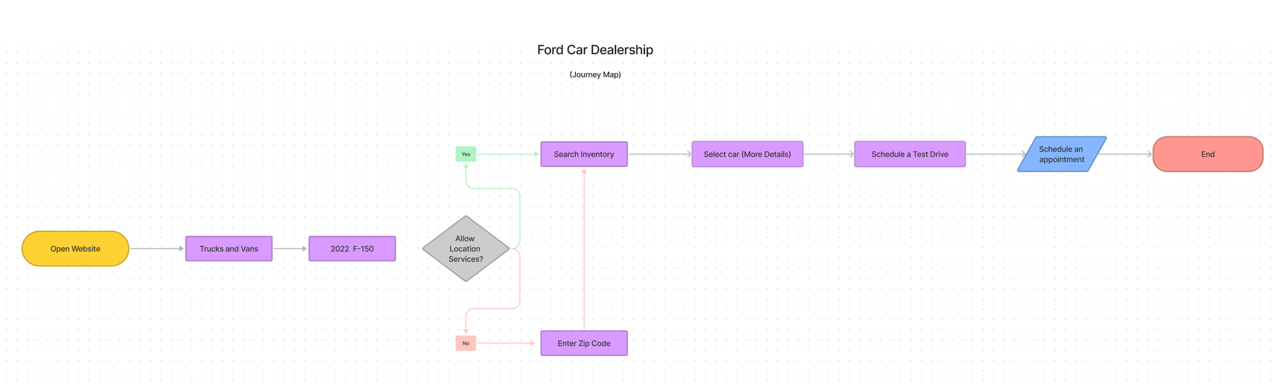
Original Site Journey Map
The main aspect I wanted to change looking at the journey map, is to streamline how a user would come to the site already looking for a specific vehicle and ready to shop. To achieve this, I removed the initial stages of having to search and choose one specific vehicle, and making a separate tab aimed for users ready to begin the steps of making a purchase.
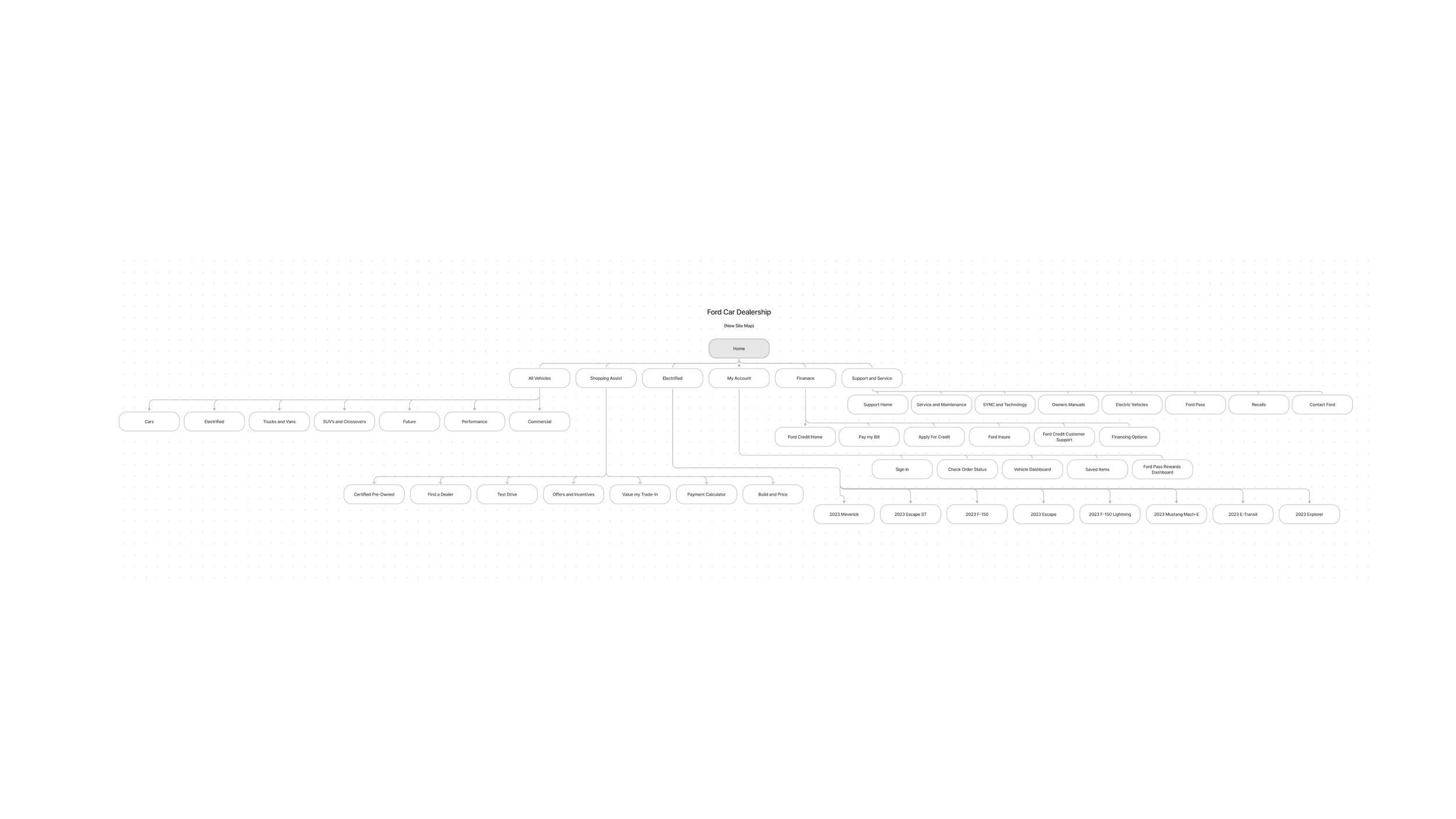
New Site Map
Updated Menu
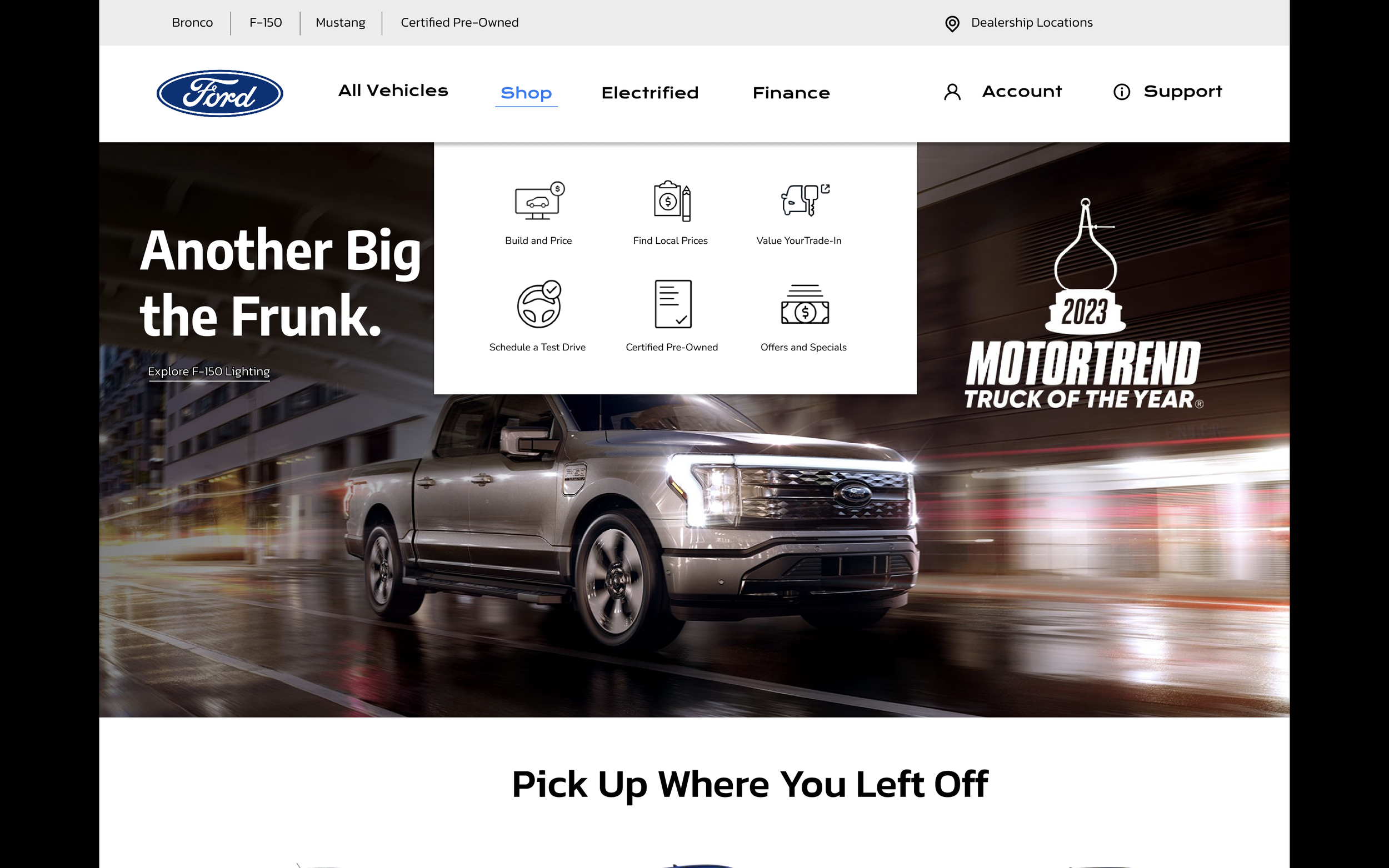
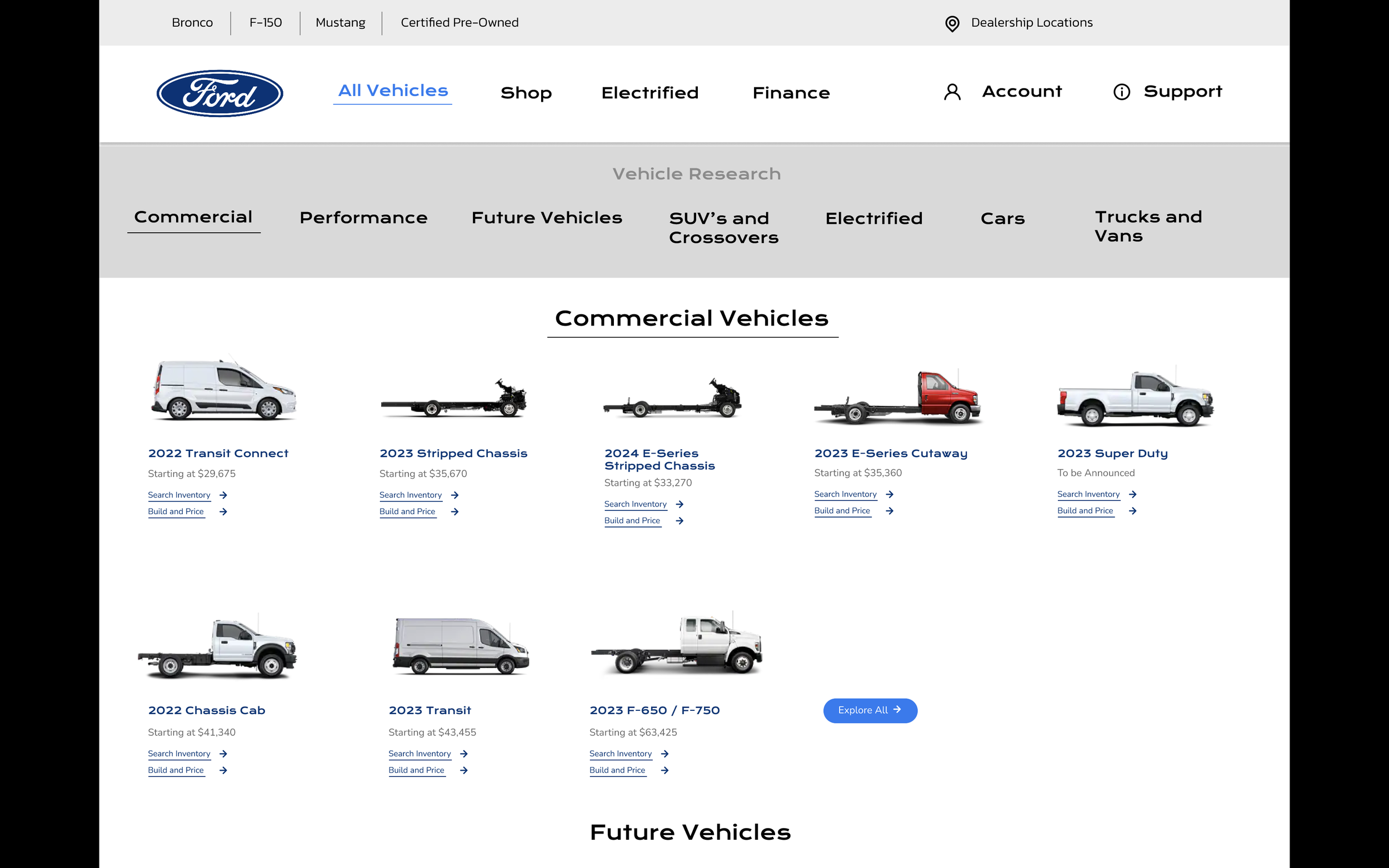
I feel like adding the different initial tabs in the menu gives the user a more clear route to what they are coming to the site to do. You can now tell where to go right from the start whether you are there to do research on vehicles, browse prices, or schedule appointment. The shop tab will help users get started on a more accurate journey earlier on in their visit.
View my prototype at the link below
https://www.figma.com/file/q46WiQk6ttTe74V9eqRqke/Untitled?t=MZrVfp2ND425IHgB-1